The main focus of chapter 3 within my dissertation is website navigation.
Navigation Styles:
Existing navigation -
Horizontal
Vertical
Burger
Artistic
The best type of navigation for my website is horizontal or vertical due to the sheer amount of content needed on the site.
Research
When users look for information, they have a goal and are on a mission. Even before you started to read this article, chances are you did because you either had the implicit goal of checking what’s new on Smashing Magazine, or had the explicit goal of finding information about “Navigation Design”.
After a couple of seconds of scanning this article, and maybe reading parts of the introduction, you may have started to ask yourself whether the information that you’re consuming at the moment is actually relevant to you—the user. Unfortunately (and as certain as death and taxes), if users cannot find the information they are looking for, chances are they will abandon their track, never to return.
Being the compassionate human being that I am, I’ll try to explain to you what this article is about, so you can make your choice either to continue reading, or not. This article is not about where you should place the menu of your website or mobile application, or about the number of options a menu should contain. It is also notabout how you visually enforce the perceived affordance of a user-interface element, and why that is so important.
This article is about the tiniest of details that goes into creating the main centerpiece of your digital product—the construction of the elements of your navigation. This is the most important aid you can possibly give to your users as they are constantly seeking a reason to walk out on you.
Words, Words, Words
The first thing I do when I start to sketch out the information architecture of a digital product based on the requirements at hand is to blatantly label stuff. This is nothing unique—I simply need to formulate a label (most of the time accompanied by a short description) of all the possible information entities I discover to be able to reveal taxonomy and relationships between them. You might have a similar approach, using tools like post-its, whiteboards or even some digital application created for this purpose. This can be the inception of small problems that will constantly grow over time if we do not assess them correctly and in a timely manner: the labels are yours, and yours alone.
“Locate store” is your label of something that enables the users to find physical stores in a mobile application. “Commodities” is your label of a view that enlists all the goods your client wants to retail on an e-commerce site. “Start” is your label on the landing-page of a website. From a linguistic point-of-view, you can analyze the meaning of sentences, words and letters in different context for hours on end.
You can look at the structure in terms of morphology, syntax and phonology, or why not look at the meaning in terms of semantics and pragmatics. Fortunately, in most cases you do not have reach as far as asking a linguistic researcher about your labeling—people in your target audience will do just fine.
 “This might be a good start!”
USER-TESTING LABELS
So what is the easiest way of doing a sanity check of the way you express the information space? A really cheap and well-proven technique is
Card Sorting. By using card sorting, you can transform your early taxonomy prognoses into
folksonomy. Card sorting not only helps you to create an informed information architecture, it also enables you to get an insight to what keywords users relate to different activities in your product.
Another test is a
Word Association game. Take all potential labelings of your navigation design and try them out on users asking them to “say the first thing that comes to mind” (in regard of what they believe to be found beneath such a navigation option—call it
Think-Aloud Protocol with a twist. For example, you could say “Products” and the participant might respond with “Price, description, information, stock”. Market researchers have used this technique for decades to ensure that the right message is conveyed by their target audience when promoting products.
Two important questions that you need to find to an answer to at this stage are:
- Can the users relate the labels in the navigation design to their explicit goals of exploring your digital product?
- Are the meaning of the words metaphorically and visually separated enough not to be confused with each other?
 “Ok, so let’s change ‘Commodities’ to ‘Our Products’ and ‘Locate store’ to ‘Our Stores’.”
REMOVING REDUNDANCY AND LOWERING THE REACTION TIME
In his masterpiece “
Don’t make me think”, Steve Krug writes, “When I look at most Web pages, I’m struck by the fact that most of the words I see are just taking up space, because no one is ever going to read them.” The more information we cram into our navigation, the harder it becomes for the users to quickly grasp the different options.
In 1935, the American psychologist John Ridley Stroop published “Studies of interference in serial verbal reactions” along with the now renowned “
Stroop effect”. Stroop had found that given the task of naming the color a word was written in, took longer and was more prone to error if the word itself was the name of a different color (e.g. the word “Blue” written in the color red).
What we can learn from Stroops discovery is that we have a hard time not reading words—even though we are given a task explicitly instructing us not to. Have a quick look at the navigation in your design and ask yourself what can be removed without losing its meaning.
 “It seems I really donʼt need the word ‘Our’ in front of ‘Products’ and ‘Stores’.”
WHAT DID PRODUCT ‘A’ DO IN SITUATION ‘B’?
If you still have not managed to convince your employer that early user testing will pay off in the long run, you should at least have the courtesy to look at the benchmark. In what way have others solved their navigation design? Just spending some time looking at what others have done will help you reach valuable conclusions. This can be really time efficient and a good way to increase product usability, since users will be able to use previously acquired knowledge by simply
recognizing similar terminology used in other products.
 “It does seem like all other websites in our business area have their contact information beneath an option labeled ‘Contact’. I better change ‘Reach us’.”
Symbols, Pictograms & Icons
Symbols, pictograms and icons in digital user interfaces are long gone from luxury to necessity. They contribute to signature, personality, recognition, and abstraction in our visual language. Furthermore, studies have given evidence suggesting that user interfaces have less favorable perceptions of usability and usefulness when only relying on textual expressions.
Why did I willfully write “Symbols, pictograms and icons” and not just “Icons” as we all love to call them? Before I start to use only the word “Icon”, I want to make sure we are all on board as to the differences (without digging too deep into the perilous depths of
semiotic science).
WHAT IS WHAT
A symbol is typically defined as an abstract representation that requires conventional knowledge amongst the users for them to fully understand their meaning. People in some cultures have learnt that the meaning of an octagon shaped sign in a tone of red communicates “Stop.” So a symbol earns meaning over time through conventional use.
A pictogram on the other hand is usually defined as simplified pictorial representation. Pictograms—or pictographs—are, as far as possible, self-explanatory and most often do not require any deep previous learnings to make any sense. You often see pictograms (and ideograms) on signposts and in environmental design since they are least contingent to produce cultural misunderstandings. For example, a sign with an arrow indicating a direction.
The definition of the word “Icon” can be a bit vague depending on the context of use, but I like to say that an icon can be a sign, symbol, picture or image that stands for or represents an object in its resemblance as an analogy for it.
Whether you should use a symbol, a pictogram, an icon or a combination of all three to help you communicate information, all depends on the situation you find yourself in. Disregarding what we use, there is some common knowledge and analysis we can use to make sure that the receivers (i.e. our users) actually understand what we are trying to convey with our design.
USER-TESTING ICONS
There is an abundance of ways to perform user testing and peer reviews of iconography. My two absolute favorites are what I have come to call “tag-that-icon” and “connect-the-dots” mainly because they are quick to perform and they give great insights into users’ spontaneous opinions (plus, they are actually quite fun to prepare and execute).
You can perform tag-that-icon in one of two ways:
- Method 1:
Give several icon suggestions to the participants and ask them to tag them with whatever comes to mind within three minutes.
- Method 2:
Randomly show the participants one icon at a time during a day and ask them to come up with tags for each icon during 20-30 seconds.
The latter has most probably proven itself to be really good and better for testing different metaphors for one specific icon when the number of participants are low.
When you have a set of icons and labels that are closing in on finalization, you can then do connect-the-dots testing. All you need to for the test are printouts with one section of all your suggested icons (in a random order) and one section with all your labels (in a different random order). Then, give the printouts to the participants and ask them to draw a line between an icon and the label they think it is coupled with.
 “At least I can be certain that all my suggested icons works for the ‘Directions’ menu option.”
REMOVING REDUNDANCY RE-VISITED
Just as with labels, avoiding redundant information in the icons is just as important. This is of course quite a bold statement from a designer, but there are many cases out there in the wild that simply add so many details to an icon that it starts to disrupt the users’ ability to interpret and differentiate them. This becomes most evident when you have common shapes in the icons that affects their intergroup
saliency (i.e. the quality by which an object stands out relative to its neighbors).
 “Do I really need the circles? If I look at them briefly or squint, they all look the same—I better change that!”
PICTURE/WORD INTERFERENCE
Given a set of lined drawings of simple objects coupled with distractor words, humans show a clear effect of increased response time in naming the drawn object. This is also known as
Picture Word Interference (PWI). What PWI can be interpreted to mean is that when an icon is paired with a label in a way that the user does not connect together, it becomes much harder for them to work out the intended meaning.
For humans, a label with “Banana” coupled with a cucumber icon would be unclear as to what it is. What makes matters even worse for users in a navigation context is; “What should I really follow—your icons or your labels?” Avoid creating distracting stimulus through semantic interference between your icons and labels.
Looking at contextual consistency and standards in regards to iconography can really help you. There are some really great resources out there for finding inspiration, but you can also use them as a source of knowledge in finding trends and standards in iconography. If 9 out of 10 result with the term “Favorites” on
Iconfinder.net that contain a star or a heart-shaped icon, then that may probably be a good starting point for your “Favorites” icon as well.
 “I have no idea what I was thinking. I think I have to throw away all of these, restart all over again and do some more user testing.”
Six Navigation Design Guidelines
After reading all of the above, you should have a good foundation to take your navigation design to the next level and place it in its intended environment along with the rest of the design and perform controlled user testing and see how they interplay. Here are 6 navigation design guidelines for you to consider as you embark the journey of designing the navigation of your upcoming project:
- Clarity:
Make sure that your navigation has a linguistic and semantic clarity that communicates to your users in an direct, efficient and adequate way.
- Simplicity:
Avoid using technical labels and icons that no one recognizes. Speak the language of the user rather than using complex terms and form factors unfamiliar to your users.
- Saliency:
Avoid having redundant and repetitive terms and shapes in your labels and icons that affects their intergroup saliency. This can easily influence your users ability to differentiate and interpret them as a whole.
- Context:
Look at the consistency and standards for labels and iconography used in the context that you are designing for. It is more efficient for your users to recognize rather than needing to interpret information that is unfamiliar to them.
- Correlation:
Avoid creating distracting stimulus through semantic interference between labels and icons. Reduce uncertainty and make sure that they clearly communicates one message as they are put together.
- Tonality:
Ensure that the tonality of the message is still consistent at the end of the design work. Colors, typography and form heavily affect the way your audience conceive and interprets the information.
Of course, not all types of navigation design contain both labels and icons. Some just use icons and some just use labels. you have roughly three cues for guiding your users: One factual (the label), one helpful (the icon) and then—the sometimes subliminal—character (color, typography and form). They do not always need to co-exist since different context requires different solutions. But your message can easily become blurred the fewer of them you use.
So ask yourself this: Can I afford to be vague in the way I communicate and help my users to reach their goal? (Hint: No!)
___________________________________________
Crit
Before I had started to design the navigation I asked a group of people what they preferred; horizontal or vertical navigation. The answer was unanimous, horizontal was the clear favourite. I have also written within my essay that web designers prefer to use horizontal navigation instead of vertical as it allows more room for content on the site.
I then asked how to represent each of the categories and most people said that imagery would be the best option. Icons were the preferred design aesthetic. I think that a range of icons will look the best from a design perspective but as my project is based around user experience I think it will be easier to use photographs of products to ensure that users can make a mental connection to what each category contains.
Idea development for navigation:
I drew out my ideas for icons but found it very difficult to come up with an icon to represent what will be found inside each category. I think that because of this difficulty it will be best to use photography instead of icons to ensure that users will not be confused.
Collecting photographs:
World foods
Bakery and Cakes
Toiletries
Food cupboard
Pets
Household
Health
Baby and child
Drinks
Fresh
Frozen
Market street
Beer, Cider and Wine
Freefrom
Cigarettes and tobacco
I took the images straight from the morrisons website to keep continuity.
_______________
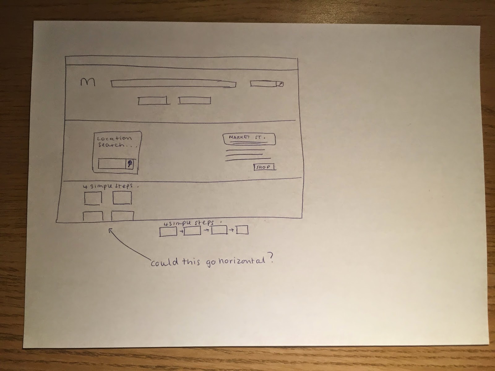
Designing the navigation:
Wireframes:
There are 15 categories so I tried two different layouts; wide and narrow.
The wide option left me with 3 blank spaces so I think the narrow option is the best.
Final navigation:


